Colour, as Josef Albers astutely observed, ‘deceives continually.’[i] As I write this text on a laborious train journey, the seat before me, I would argue, is a faded medium vermillion red, in line with the train operator’s corporate identity. However the man adjacent to me, who appears lost in a daydream, may insist that the seat is in fact, cadmium orange. Who is right? Clearly, this anecdote is rooted in Albers assertion that colour evokes innumerable readings. This complex process is defined by a myriad of factors – too numerous to fully explore here. Ultimately, our interaction with colour is a subjective experience, one that is both perceptive and cognitive.[ii]
For thousands of years, creatives have embraced the allure of light – and colour – as an artistic preoccupation. From early Islamic architecture that saw nur (light) embraced as a symbol of ‘divine unity’ to J.W.M Turner’s masterful depiction of natural light through pigment to contemporary interior design techniques, light has been a hugely significant influence on artistic thought. Crucially, light and colour have proved to be complex and challenging mediums in their own right. As the recent blockbuster Hayward exhibition Light Show demonstrated, there is an insatiable appetite for artworks that create, arguably, the most evocative and accessible sensory experiences.
The work of Liz West frequently operates in a dialectical relationship between site-specify and spatial/sensory experience. By manipulating artificial light, colour and sculptural form, her work directly transforms its environment by creating experiential encounters. Viewers will often encounter installations emitting exuberant colours that bathe the gallery walls in an iridescent light. Driven by a cerebral engagement with colour theory, West understands that the ambience, hue and saturation of artificial light can dramatically influence the mood and behaviour of viewers. Every burst of colour, hue and shadow is a calculated decision.
Responding to the raw, spatial idiosyncrasies of Piccadilly Place, an empty commercial unit in central Manchester, West has presented new installations and drawings. Freed from the neutrality of the white cube gallery – and it’s complex diktats – West’s installations absorb and react to the context of this non-traditional venue.[iii] Open until 9pm each night of West’s residency, the large window panels of Piccadilly Place represent an interesting juxtaposition between the installations and its immediate environment. As the light ebbs away towards the dark autumn evenings, the weakened evening light will strengthen the visual resonance of West’s artificial light; greatly impacting each viewer’s experience of the work. Colour deceives continually, I believe. This relationship between the materiality, environment and sensory experience of her work forges an interesting context.
West’s recent installation Consumed (2013) is a collection of found and recycled objects, gathered and stripped of any identifiable labelling. These consumerist objects are displayed within three large perspex cases. Underneath each of the vitrines, powerful light boxes emit primary colours, soaking the plastics and radiating vibrant hues that bleed together on nearby walls. Lowering our gaze inside the light boxes, the ethereal reflections further distorts our perception of the objects. In elevating these mundane objects by directly appropriating museological display methods, such as the vitrine and systems of ordering/classifying objects, West asks us to consider the inherent beauty that emerges in these gatherings.
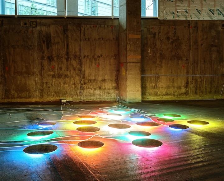
Vanishing Boundaries (2013) signifies a connection between her long-standing artistic interests (including methodically gathering objects) and new sculptural experiments. Comprising of an array of reflective discs protruding above floor level, the installation emits intense bursts of light from underneath the discs; the concrete floor is transformed into a field of colour, connected by the trailing electrical wires. The reflections of the discs also distort ceiling are multiplied when the viewer explores the work. The hues of each light gently diminish creating, as the title of the work hints, soft colour mixes. Notably, the reflective discs also deny us full exposure to the source of light: a method that West has employed in previous installations.
 Variable dimensions, this image shows 500cm (w) x 500cm (d) x 10cm (h) approx. 2013 - Image Credit: Stephen Iles")
For West’s next installation, a sizeable sheet of perspex has been laid over an assortment of fluorescent sticklights. Your eyes begin to assess the situation. Unsurprisingly, the vivacious sheet of perspex transfixes them; cerise, lavender, green, blue and yellow and orange mix fluidly and without any clear demarcation. The robust form of the sticklights project out from underneath, like a glimpse at the inner workings of a complex industrial machine. You notice that four circular discs hold up the sheet; they are humble paint pots. Dispersion of White (2013) opens up a dialogue between the work and the practice of painting. The subtle introduction of the paint pot is a loaded gesture, one that creates a visual dichotomy to the painterly sensibility of the light mixing with the perspex.
 Variable dimensions, this image shows 150cm (w) x 140cm (d) x 30cm (h) 2013 - Image Credit: Stephen Iles")
The fluorescent sticklight, a key material in West’s new installations, is perhaps one of the most effective visual tools. Aside from its obvious exuberant colouring, its most striking feature is its stripped back materiality. A mass-produced artificial light, fluorescent sticklights have been components in western culture for well over a century. For her installation, West has carefully modified each sticklight to radiate a particular colour. This chosen colour palette is reminiscent of the neon lights that were so prominent in the 1960s that coincided with the emergence of installation art.
 Installation (T5 fluorescent sticklights, extension cables) Variable dimensions, this image shows 250cm approx. diameter x 40cm (H) Image courtesy of Liz West.")
By methodically considering and then mixing each sticklight in relationship to each other, West cultivates our perceptions of the work, drawing on Albers practice based theory that colour can only be truly understood in relation to other colours and, crucially, our own knowledge of the colour spectrum. The raw exuberance of the sticklights then becomes a trigger: the viewer is needed to activate the work.
A significant development in West’s practice is the inclusion of a selection of recent drawings. These drawings, the first time West has exhibited such works, have been created using an array of accessible, yet distinctive materials: electrical tape, spray paint, ink and mirror. A commonality in all of her drawings is a sense of exploration and freedom. Spray paint flickers across the page, overlapped by an uninhibited application of colour. In their materiality and composition, her drawings possess an undeniable sculptural resonance; one can easily see them informing future installations. Yet, it would be erroneous to label them as simply preparatory studies.
The relationship between the sculptor and the act of drawing is a highly personal affair. Technical drawings are, predominately, confined to a studio notebook – never to be exhibited but indispensible in the struggle of translating ideas into concrete outcomes. As creative endeavour itself, drawing forges a path to artistic truth, as this quote from sculptor Barbara Hepworth on the critical need for drawing explains: ‘…I search for forms and rhythms and curvatures for my own satisfaction…but it is in a general sense – that is – out of the drawings springs a general influence.’[iv] The ‘general influence’ that Hepworth suggests elucidates the power of drawing to sculptural practice: each mark influences, informs and nourishes the artistic process. However drawing shouldn’t be confined to paper based activity. During the creation of her work – whether drawing on paper or arranging the order of fluorescent sticklights on a concrete floor – West uses each element as an exploratory tool; experimenting with colour and space until the work is harmonious with its surroundings.
The title On Brown & Violet Grounds is inspired by Albers seminal text Interaction of Color. Appropriating a similar vernacular to Albers, West playfully acknowledges that experimentations are critical in interrogating the possibilities of colour, light and space. The title of this text, Schauen, is an Albersian term that, in context, translates as ‘seeing’ – vision coupled with fantasy and imagination.[v] It is this freedom in looking, underpinned by our own perceptions, associations and knowledge of colour, that will enable the viewer to fully immerse themselves in West’s experiments in and with colour, light and space. Jack Welsh, September 2013.