1:1 – Architects Build Small Spaces
Victoria and Albert Museum
15 June – 30 August 2010
With the economic climate having brought a large percentage of architectural developments to a halt over the last eighteen months, the recent austerity drive by our coalition government has accelerated these measures to a practical stand still. Architectural firms and larger developments are being talked under – even the feted Tate Modern extension unsafe from wildfire speculation amidst the spectre of the primed unwieldy axe.
Set against this seemingly deteriorating and literal financial backdrop, the V&A invited nineteen architectural practices from across the world to submit concept designs for newly designed structural milieus to be dotted across the museum for the exhibition 1:1. From nineteen submissions, seven were constructed and installed in situ. As the title of the exhibition suggests, the scale of these fabrications were large enough for the viewer to enter or interact with each design – but considerably smaller than the scale of a normal building. Given that the concept of the brief was ‘refuse and retreat’ the emphasis on materiality and design reflected not only the growing sense of responsibility that is intrinsic in the designs of socially aware architectural practices, but also attempted to tap into locality and engage emotional depth, something that is often lost in larger architectural designs.
The usage of the phrase ‘test site’ used to describe the metaphorical blank canvas of the V&A intrigued me. Test – a word that can be attributed to describe the process of experimentation in judging success or failure – and architecture are two words that don’t sit together easily. The acceptable margins for error within architecture are few and far between; the impact of a slight misjudgement can have socially negating consequences. Taken into the relatively safe haven of a museum and straddling the context of an artwork, this exercise encouraged a compromise between the often-stoic precision of architecture and the emotive nature of an artwork.
The structures indeed responded site with each design being informed by their specific location within the museum. The starting point of 1:1 is the Porter Gallery that houses Vazio VS Spiral Booths, a rather cold metallic staircase structure that will facilitate performances during the exhibition liberating the structure from it’s static rigidness. The Rural Studio design Woodshed presented a wooden structure that places great emphasis on its material and construction properties (the wood was sourced from forest thinnings in Wales) and the design promotes the use of reusable natural materials but ultimately flourishes within the context of a gallery environment. The conditions of a gallery display enrich Woodshed with the positioning and lighting adding weight to a simple design whereas one cannot escape the overriding sense of coldness reserved for the stairwell of a multi storey car park with Spiral Booths. It would have been interesting to see the elements of performance over the duration of the exhibition possibly animate this structure.
Aside from the placement and specific design of these two structures within a gallery setting, the rest of the realised structures were dotted around the museum requiring the viewer to follow a trail across the V&A. Differing from the first encounter of two designs, the rest of the trail (if this is an appropriate term) encompasses a series of singular interactions between viewer and the stand alone structure. The temporary placement of these new temporary structures alongside existing V&A exhibits and architecture provided a weighty context. To gain entry into the V&A marketing departments work of choice for exhibition publicity Beetle’s House by Terunobu Fujimori, you are required to remove your shoes and climb a ladder to peer into Beetle’s House in a display of Japanese etiquette although I found the physicality of the structure slightly too extreme for a 6-foot plus man. Beetle’s House achieves perhaps the most interesting dialogue between space and environment with the location of the piece in front of impressive permanent display of the huge façade of Sir Paul’s Pindar’s House, complementing the scale, design and cultural properties of the small hybrid dwelling.
Near the staircase V&A National Art Library, Rintala Eggertsson Architects design Ark is literally a vessel to hold books. Comprised of a wooden structure with hundreds of shelves adorned with books stacked to face inward offering an array of decorative book spines when you are ascending/descending the staircase. Tapping into the ‘retreat’ aspect of the brief, the structure contains small rooms complete with chairs for viewers to browse books they select from the shelves. The aspiration of studious contemplation seems to be an idealistic idea when coupled with the busy environment the structure is involved with and it’s unfortunate resemblance of an IKEA shelving unit display. The decorative nature of the books only fuelled this impression as the uniformality of the coloured scheme organised books rendered them coloured blocks.
Studio Mumbai Architects In Between Architecture proves to be one of the more successful relationships between the museum and built structure. The scale cast of an illegal dwelling or unauthorised settlements that are commonly constructed in Mumbai as shelter for the poor slots in between sculptural and structural casts from the V&A collection. The correlation between these casts of traditional monuments and sculptures and the cast of a temporary shack is thoughtful and as a concept raises issues between the preservation of buildings, functionality and the wider necessity of providing shelter. The status of the cast enters into this dialogue. With the V&A possessing hundreds of casts of artworks that have become, in some instances, the main evidence of existence of the lost original work, the deliberately unresolved positioning of the cast of In-between Architecture within the gallery stokes the debate of the validity of the cast as an artwork.
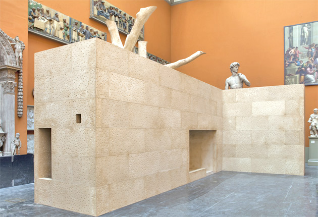
The external structures focus on natural materials with and a freedom of design that approaching the brief with the knowledge of being located outdoors. Helen and Hard Architects Ratatosk utilises five Norse ash trees that has been separated and spliced together to create a design that draws on Norwegian mythology and fairytales. Consequently the design is less of a regimented structure and benefits with a sense of freedom. This freedom is evident through it’s playful if airy design and allows focus on the methods employed in its creation, in this instance computer-aided designs and the physical construct – although Woodshed is a more successful example of this.
As noted in the interpretation material, architectural exhibitions often smother viewers with Masterplans, technicalities and models rather than being able to present the physical outcome due to the obvious reasons. The interpretation material within the exhibition is notable and informative presenting a compromise between a museum exhibition and the detail of an architectural display. For me, one of the fundamental successes of 1:1 was not only facilitating designs that creatively approached the relationship between architecture, viewer and environment but also rediscovering a magnificent museum.